
How We Built A Brand Identity Around Reflection & Clarity
Building a brand asset around the space before the decision.
Threshold came to us with a name and a broad idea of what the brand wanted to be.
There was no defined visual identity yet. So instead of starting with the question, “What should Threshold look like?”, we started with:
“What should people feel like when they see threshold?”
We looked at the industry, the nature of the conversations happening within it, the audience, and what Threshold wanted to create for the people it worked with.
What emerged was a brand centred around reflection, perspective, conversation and clarity. And that gave us our starting point.
The Brand Building Process
01. Understanding the space
Before getting into colours, fonts or logos, we spent time understanding the world Threshold would operate in.
The space is inherently human. People come to it with questions, uncertainty, different perspectives and decisions they are trying to work through.
That meant the identity didn’t need to feel authoritative or prescriptive.
It needed to feel inviting, calm and considered.
That became the first creative cue.
02. Defining the visual direction
From our research, we started exploring different visual territories.
We deliberately stayed away from anything that felt too loud, corporate or visually crowded.
Instead, we gravitated towards:
Earthy tones.
Minimal forms.
Clean typography.
Subtle details.
Plenty of breathing space.
The intention was to create something aesthetically strong without making the aesthetics the point.
The brand needed to have personality, but it also needed to leave room for the conversations happening within it.
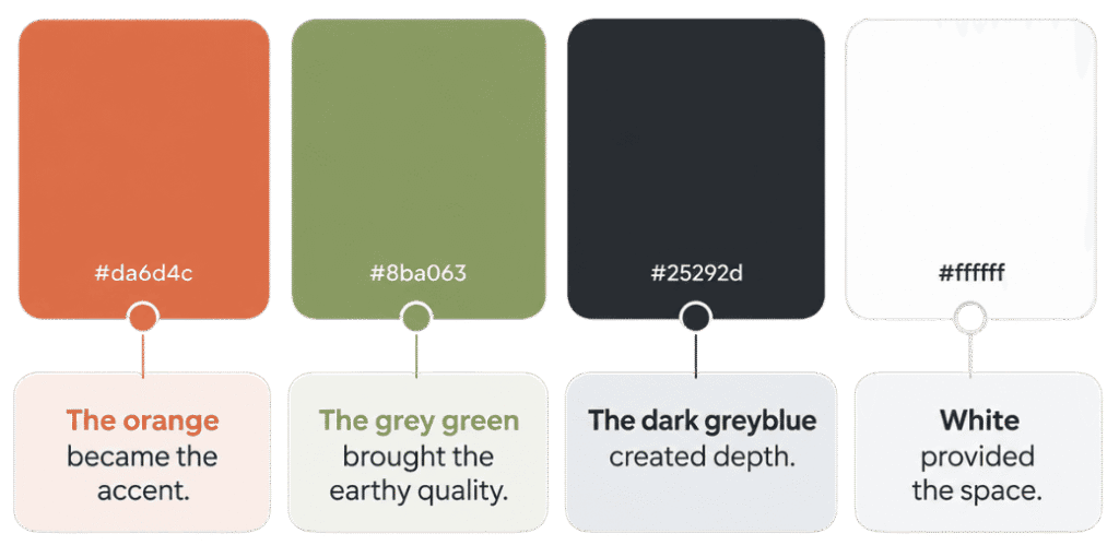
03. Building the colour palette
The visual direction naturally led us towards an earthy, understated colour palette.
We explored how different tones could work together to create the right balance of warmth, grounding and sophistication.
The final system became:
Rather than using colour to make the brand louder, we used it to give the brand quiet distinction.
04. Finding the right type
Typography needed to follow the same principle.
We explored typefaces that could bring a modern character to Threshold without making the identity feel overly polished or formal.
That led us to:
H – Newsreader
P – Outfit
Newsreader gives the brand its more distinctive and refined character.
Outfit brings clarity and modernity.
Together, they create a balance between personality and functionality.
05. Creating the identity
With the visual language beginning to take shape, we brought the elements together through the logo and icon mark.
The logo was intentionally kept simple.
The lowercase wordmark feels approachable and understated, while the orange full stop creates a small but recognisable point of distinction.
From there, we developed the icon mark around the T, incorporating the circular element from the full stop and a subtle sense of reflection through the curved form.
The idea wasn’t to create an icon that explained everything.
It was to create something simple enough to recognise and meaningful enough to belong to Threshold.


THE OUTCOME
From a name to a visual identity.
What started as an open creative brief became a complete visual system for Threshold.
A system where every element has a reason to exist.
The colour palette
creates a grounded and calming visual environment.
The typography
brings together modernity, character and clarity.
The wordmark
keeps the brand simple and recognisable.
The icon
gives Threshold a visual asset that can exist independently of the name.
The tagline
“Clarity before the Decision” gives language to the philosophy behind the brand.
Together, they create an identity that feels:
Minimal. Earthy. Modern. Thoughtful. Distinctive.
THE RESULT
The outcome wasn’t simply a set of brand guidelines. It was a visual language that gives Threshold a consistent way to show up.
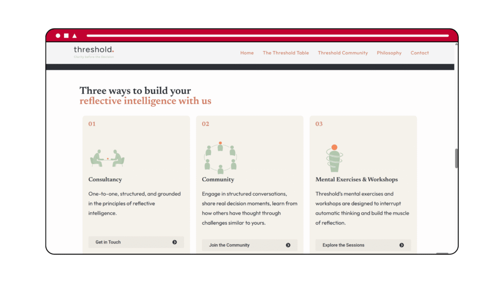
Across its different touchpoints, the brand now has a defined system for how it looks, feels and communicates.
But more importantly, the identity reflects the experience Threshold wants to create.
It doesn’t try to tell you what to think. It creates the space to think. And that is where the identity finds its purpose.