
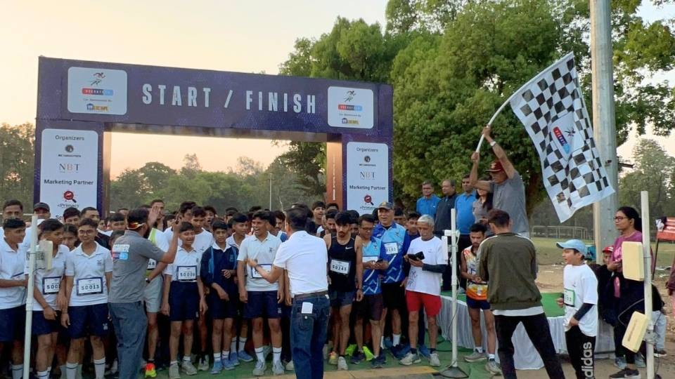
Marathon Branding: Building the Veerathon Brand
Veerathon was envisioned as more than a marathon. It was created to bring together fitness enthusiasts, veterans, families, and supporters of the armed forces through a shared experience rooted in purpose and impact.
While the event had a meaningful cause at its core, it needed a brand identity that could stand out in a crowded marathon landscape. The objective was not only to attract registrations but also to create a brand that participants could connect with, remember, and proudly associate themselves with.
Our role was to build the Veerathon brand from the ground up, developing its identity, positioning, visual language, and community framework to establish a strong foundation for future growth.
The Challenge
The marathon ecosystem is highly competitive, with most events positioning themselves around fitness goals, race timings, personal achievements, or athletic performance.
Veerathon needed to communicate something different.
The challenge was to create a brand that could:
- Stand out among conventional marathon events
- Reflect the values of courage, resilience, and service
- Appeal to both runners and non-runners
- Create an emotional connection beyond race day
- Build a sense of community around a larger cause
- Establish a scalable identity for future editions of the event
The objective was not simply to design a logo or event merchandise. The goal was to create a brand that people could believe in and become a part of.
Brand Strategy and Positioning
Before developing the visual identity, it was important to define what Veerathon would represent.
Rather than positioning it as another running event, the brand was built around a larger purpose.
Veerathon was positioned as a platform that celebrates courage, perseverance, and service while bringing civilians and veterans together through fitness and community participation.
This positioning helped the event differentiate itself from traditional marathons that focus primarily on competition and performance.
The brand was designed to resonate with:
- Fitness enthusiasts
- Recreational runners
- Armed forces supporters
- Families
- Corporate participants
- Individuals looking to contribute to a meaningful cause
The result was a brand that balanced athletic energy with emotional significance.
Creating the Veerathon Identity
The visual identity was developed to reflect the event’s purpose while maintaining the energy expected from a marathon brand.
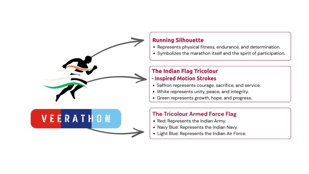
The logo was designed to represent movement, determination, and strength while remaining simple and recognizable across various applications.
The identity system needed to work across:
- Digital platforms
- Event branding
- Merchandise
- Print materials
- Social media assets
- Sponsorship collateral
A clean and scalable design approach ensured consistency across all touchpoints, regardless of format or medium.
The result was an identity that felt both dynamic and meaningful.
Building a Distinct Visual Language
Creating a logo alone was not enough. The brand required a complete visual language that could be consistently applied across every participant interaction.
The visual system included:
Logo
A unique and powerful logo was designed to reflect the event’s purpose and spirit. The logo symbolized resilience, honor, and support for veterans, serving as a central visual element across all promotional materials.
Clear guidelines were established to maintain consistency across all communications and branding materials.
Color System
A defined colour palette was developed to reflect energy, determination, and the spirit of the event while ensuring strong visibility across both digital and physical environments.
Typography
A typography system was selected to balance readability with impact. The chosen typefaces allowed the brand to communicate clearly while maintaining a strong visual presence.
Graphic Elements
Supporting visual elements were created to reinforce the identity and provide flexibility across promotional campaigns, event materials, merchandise, and digital assets.
Together, these elements formed a cohesive brand system capable of supporting the event at every stage of its growth.
Brand Assets and Event Integration
To create a consistent participant experience, the brand identity was extended across every major touchpoint associated with the event.
This included:
- Event merchandise
- Race bibs
- Finisher medals
- Certificates
- T-shirts
- Signage
- Goodie bags
- Digital creatives
- Social media assets
- Event communication materials
Every branded element was designed to reinforce the same visual language and brand values.
This consistency helped strengthen brand recognition and create a more professional event experience.
Creating the Veer Warriors Community
One of the most important branding decisions was to create a community identity for participants.
Instead of referring to attendees simply as runners or participants, the brand introduced the term “Veer Warriors.”
This transformed the relationship between the event and its audience.
Participants were no longer registering for a race. They were becoming part of a community connected by shared values.
The introduction of the Veer Warriors identity helped:
- Strengthen emotional engagement
- Create a sense of belonging
- Encourage participant advocacy
- Improve community participation
- Extend the event experience beyond race day
The community identity became a powerful extension of the Veerathon brand and played a key role in fostering long-term engagement.
Conclusion
The branding initiative helped transform Veerathon from an event concept into a recognizable and purpose-driven brand.
Key outcomes included:
- A distinctive identity within the marathon ecosystem
- Strong alignment between the event’s purpose and visual representation
- Creation of the Veer Warriors community identity
- Consistent branding across all event touchpoints
- Increased participant connection with the event’s mission
- A scalable brand foundation for future editions
More importantly, the branding established Veerathon as more than a marathon. It created a platform where fitness, community, and purpose could come together under a single, memorable identity.